We use cookies to make your experience better. To comply with the new e-Privacy directive, we need to ask for your consent to set the cookies. Learn more.
Photolab
0
My Cart


A histogram is a very useful but extremely misunderstood tool in the photographer's toolkit. It is a very powerful way to ensure you get the correct exposure on your images. We're going to go over what a histogram is, how you read it, what useful information it can tell you, how to leverage it to take better photos, and more.
A histogram is a bar graph that represents your image's pixel exposure range. In short, histograms show the number of tones of a certain brightness that are present in your photograph. They start at 0% brightness (pure black) and go up to 100% brightness (white). The left side of your histogram shows your dark tones, and the tones start to get lighter by shades as you move right.
The middle of your histogram has mid-tones that aren't dark or light. If you look at the bar graph's vertical axis, you'll see the number of tones based on a certain brightness level. So spikes at the left end of the graph indicate a lot of dark tones, spikes in the middle indicate a lot of mid-tones, and spikes at the right indicate a lot of bright tones.
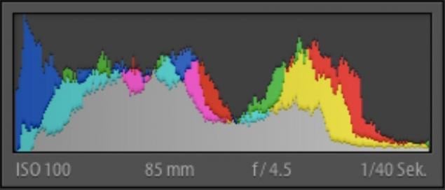
Tone curve, exposure dependency, and other settings all affect your histogram's look. If you want to know how many pixels are in a certain tone, look at the peak. Every tone is a single pixel wide ranging from 0 (black) to 255 (white).
Frank Schulenburg [CC BY-SA 3.0]
You can learn a lot of different things simply by looking at an image's histogram. For example, you can tell whether or not an image is well exposed. You want to see a histogram that reaches from edge to edge without having a large gap on one side or the other. It also shouldn't go way up one side while staying down on the other.
Ideally, you want to see a histogram that is just barely touching both the left and right edges. It shouldn't run up the sides, and there should be a decent arch right around the centre of the graph. This may not be perfect for every situation though.

Jaroslaw Jankowski DG [Public domain]
This image could be a photograph of a dark image. The spikes on the left indicate a high concentration of dark tones, implying an overall dark image. However, this doesn't necessarily mean it's wrong because just because it has a lot of dark tones - the image may just contain a prominent patch of black pavement or a black cat, etc. Note that the histogram doesn't correspond to where the dark or light sections are on an image. I.e. the spikes on the left indicate dark tones somewhere throughout the image, not necessarily on the left-hand side of the image.
Rodrigo Dantas Nunes [CC BY-SA 4.0]
This histogram shows a light subject like a cloud or a white tiled wall. They have mostly light or white tones, and there are only a few dark areas in the scene (left-hand side). This is correct for a primarily white subject because the histogram shows primarily light tones. If you changed your exposure to make it the histogram arch in the middle, you'd end up with more of a grey-looking cat than a white one.
If you run into gaps on either side, this tells you that you are missing some information, but it's easy to gently shift your exposure without losing your photograph's detail. If your histogram is too far in one direction and it doesn't touch an edge, you can quickly and carefully shift your photograph's exposure to bring out more tones.
Rodrigo Dantas Nunes [CC BY-SA 4.0]
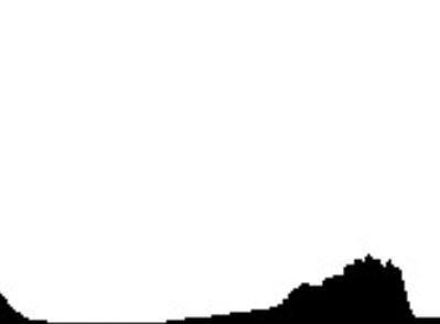
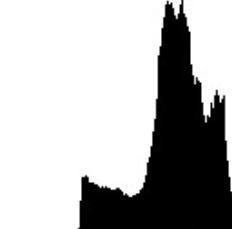
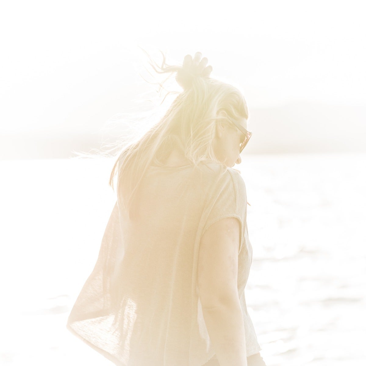
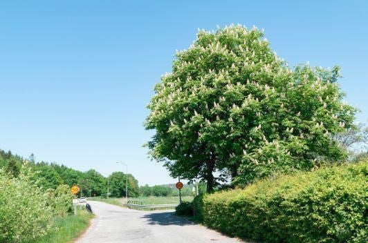
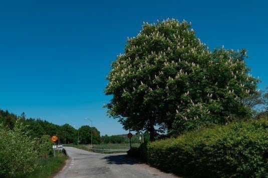
The histogram above shows that you're going to end up with a very overexposed photo. See the gap along the left side? This means that there aren't any black tones represented in the final image. Unfortunately, it also means that the white areas will make you lose lots of little details, and you may not be able to fix it. This histogram would tell you to decrease your exposure. A photo with a histogram like this would have a similar exposure profile to this image:
Now take a look at the below histogram. It shows you the exact opposite of the one above. The right side of the graph has a large gap. When you see this, it tells you there isn't a lot (or any) white tones represented. Your resulting image will be extremely dark, or too dark to use. However, it's possible to slowly give the photograph more exposure without losing details or sacrificing quality. You'd want to adjust this until the graph barely touches the right side.
Jaroslaw Jankowski DG [Public domain]
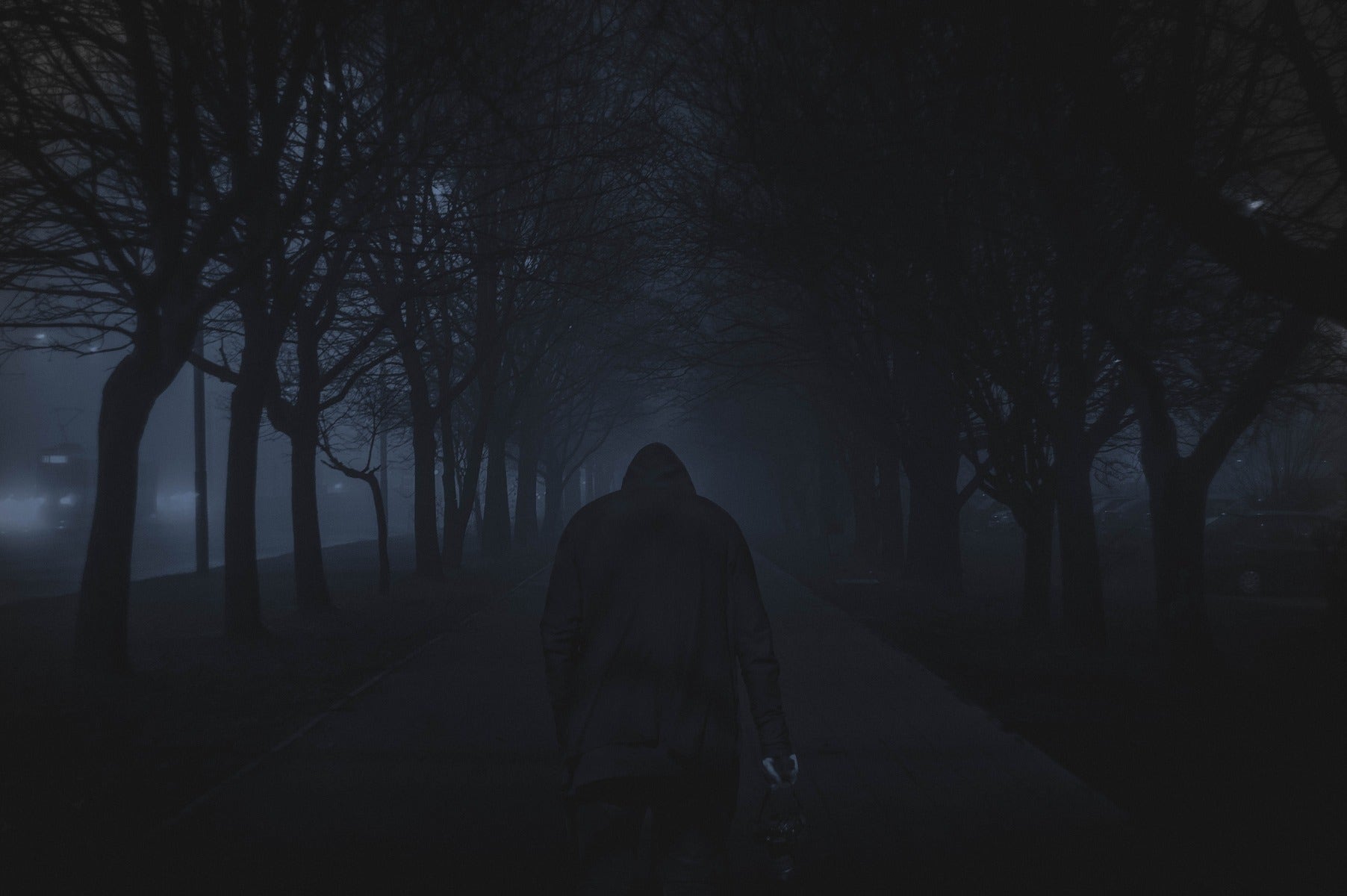
Below is an example of the exposure profile of a photo with this kind of histogram:
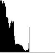
Sometimes, your histogram will have spikes running up the right or left edge of the graph and are cut off, like in the below histogram. This means you "clipped" the tone in that area and lost detail. It's usually impossible to recover these areas in post-processing, so you want to try and avoid this as much as possible. Try to expose your image so the histogram just kisses either edge of the graph (as opposed to cutting off right in the middle of a spike). This means that you have the widest dynamic range without clipping either the dark or bright tones. If you can't quite make that work, note that digital cameras can generally recover details in underexposed areas better than they can in overexposed areas, so when in doubt, underexpose your images a little.
Rodrigo Dantas Nunes [CC BY-SA 4.0]
However, some photographs don't allow you to keep your histogram in a set range. Maybe you're going to photograph a sunset, deep shadows, bright sunlight or a building's interior where you can see outside windows. In cases like this it may be impossible to get a "properly" exposed histogram.
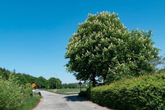
Many photographers can use histograms to measure their exposure without even looking at the photo itself. A "correctly exposed" histogram would have most of the tones right in the middle in a nice arch. The extreme edges of the graph would have no tones. The following is an example of a correctly exposed image. Notice how there are dark tones in the shadows under the tree and buses, and bright tones where the sky meets the trees, although neither are clipped.
W.carter [CC0]
An overexposed histogram would give you a photo that is too light. Many tones in the photo are very bright, and you won't see many darker tones anywhere. A portion of your photograph could be completely white (blown out). If this happens, you'll lose all of the small details. If you look at a histogram of an overexposed photo, you'd see a strong right-sided shift.
W.carter [CC0]
The final type of exposure is underexposure. This is where you get a photograph that is too dark. You won't see a lot of bright details, and you can lose details to shadow. The histogram of this photo will have a large left-sided shift. Most of your tones will end up in the shadow ranges, and you could even turn some of them completely black (clipped).
W.carter [CC0]
Now that you know what a histogram is, how to read them, and what it tells you with different examples, we'll tell you how to use it to take better photos. Most cameras can show you a histogram overlaid right on your screen. Looking at this histogram as you shoot will tell you whether or not you're about to take a great photo.
Before you take your photo, look at the histogram and see where all of the pixels are. You can set your camera up to either lay the histogram over the screen, or it'll show up in a small box that moves as you adjust your angle and lighting. Depending on the camera, you'll see a solid graph, or you can see three colours. There's a colour for red light, blue light, and green light. All of these lines will combine to tell you how well your exposure is on your photo.
If you see one large peak on the left side of the histogram, you may want to increase exposure by adjusting aperture, ISO or shutter speed. Of course, if you're taking a picture of a dark subject, like the night sky, your histogram should be weighted to the left.
On the other end of the spectrum, if your histogram has a right-sided peak, your photo could be too overexposed. If you see this, you can reduce your exposure. This will reduce the amount of light your camera is capturing.
You can also adjust your photo's exposure after the fact using photo editing tools. When you open the photo in your chosen editing program, use the brightness, shadow and exposure tools to tweak your image. But remember, if you've clipped the dark or light areas you won't be able to bring that back in software, so it always pays to get it right in-camera, and a histogram can let you do that.
Is it time to upgrade to a new camera that shows you the histogram before you take your shot? Maybe you have more questions about using histograms to get beautiful shots each time you use it. Either way, our staff are here to help. You can reach out and get in touch with us for questions, concerns or advice on picking out the best photography equipment.


Comments
No Comments yet. Be the first to comment.