
Written by
Sharon Blance
Sharon Blance is an award-winning photographer focused on human-centred commercial and editorial photography. She's half of
Image Workshop, a Melbourne-based creative duo helping brands and businesses create experiences and tell their story. Her clients include Toyota Australia, Beats By Dr. Dre, The University of Melbourne, and more.
The tighter the project budget, often the more innovative you need to be to make something cool happen with limited resources. In this case it made us go super conceptual, executing a simple-yet-unique photo concept that went on to be a finalist in the Australian Photography Awards and won Silver in the PX3 Prix de la Photographie in Paris.
And it also goes to show that the best ideas really DO come out of nowhere when you're in the shower (in this case, on the morning of the shoot!).
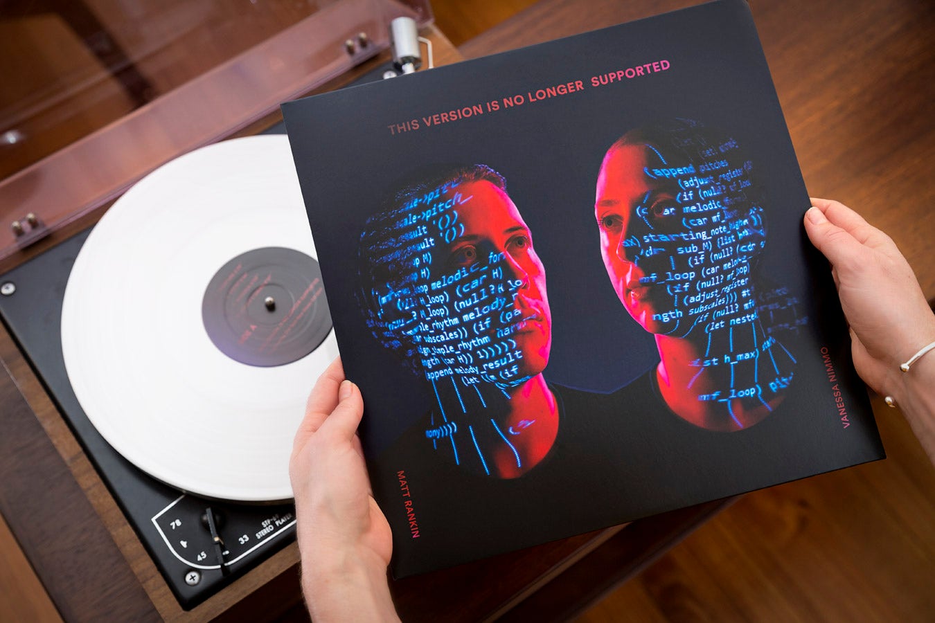
"This Version is No Longer Supported", limited white vinyl edition
Retro-futuristic android inspired theme? Check.
Coloured lights and tech-y projections? Check.
Personal love of sci-fi and surreal weird stuff? Double-check!
There's nothing better than a creative shoot that combines a bunch of things you personally dig - for me that list would be: experimental lighting, lurid colours, 80s vibes and retro sci-fi.
So I was pretty stoked when Melbourne experimental music makers Matt Rankin and Vanessa Nimmo asked me to create cover art for their debut album "This Version Is No Longer Supported". Their concept album uses sounds sampled from retro technology items - the whir of a rotary dial telephone, clacking typewriter keys, beep-boops of a dial-up modem, etc. - and weaves them into a nostalgic soundscape using sampling, looping, and computer processing.
The brief: 'Retro, dark and creepy'
Matt and Vanessa asked for the album cover image to:
1) feature their faces
2) be 'dark and creepy', and
3) "if we could somehow look like automatons or robots, that would be cool."
Inspired by their experimental retro-electronic music I was excited to draw on my love of all things 80s, robots and retro-futurism to create an image with a Kraftwerk-ian retro-futuristic vibe.
Keeping things 'doable'
Primary distribution of the album would be digital (Spotify, iTunes, etc.) so the cover art needed to be eye-catching at a small thumbnail size - a key consideration for music promo imagery these days.
But! There would also be a small release on limited edition vinyl - niiiice! - so we also wanted to consider a companion back cover image for the vinyl edition. More on that later :)
Given our overall budget was approximately 27% less than 'the smell of an oily rag', creative ingenuity was required to come up with a great eye-catching shot with little production outlay. Kind of like that time we built a replica cello out of scavenged junk for Matt & Vanessa's live show.
Keeping things 'doable on a budget' often means finding a simple-yet-elegant concept that doesn't require detailed location set-dressing or elaborate prop or set-building.
So, even though we all totally fell in love with this blue robot-y reference image when discussing concept ideas, we decided that finding a retro-industrial set and building robot versions of Matt and Vanessa was (sadly) beyond our timeframe and budget on this particular occasion. Damn!
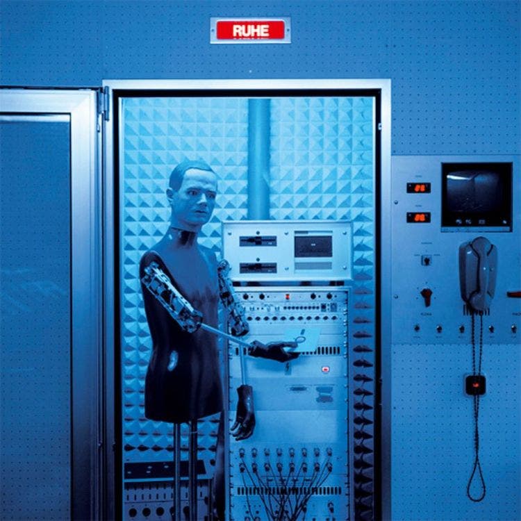
One day I will build me a robot to photograph!
Photo of Kraftwerk's Kling-Klang studio by Peter Boettcher
Concept development - playing with light
Since Matt and Vanessa wanted the imagery to feature their faces, I decided to do simple headshots in studio, but we'd play with colour and light projections as an inexpensive alternative to having an elaborate set or needing props to add interest.
I borrowed an old digital projector (like seriously old and low res - PERFECT!) off a friend and started playing at home with what we might project onto their faces. I wanted the projected image to reference the idea of 'music' or 'electronica' and was considering using imagery of circuit boards or pictures of musical notes.
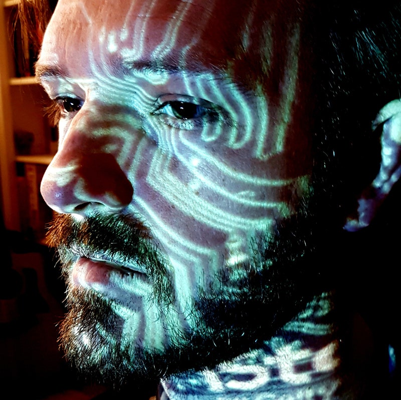
Early at-home concept testing on my partner Brence with circuit diagram projection for that 'electronic' vibe
Last moment shower inspo!
We shortlisted some iStock images of circuit boards and musical notes to try at the shoot. But luckily my stewing brain had another plan, and literally on shoot-day-morning I was struck by an idea suddenly and from out of nowhere mid-shower - and immediately jumped out of the water to phone Matt:
"Matt, can you email me some of the actual music-based computer code you've written?"
Matt was happy to comply (good android!) and we ended up beaming his own music-processing computer code through the projector, which was so cool because it contained groovy little phrases like "append pitches" and "loop melodic forms".
I'm so happy this idea came to me because it adds a relevance and personal specificity to the image that generic 'stock' images of circuits or music notes wouldn't have. It's a great reminder of how concepts can evolve from an initial idea and take on a life of their own once you get going. When a concept is born it can take shape of its own accord and will 'suggest' things to you if you let yourself hear it.
Lighting the shot
In studio I busted out a Profoto Colour Effects gel pack and spent the morning prelighting the concept using Brence as a stand-in before Matt & Vanessa turned up.
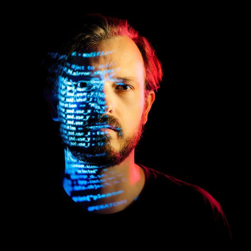
Brence standing in for studio light testing. #doandroidshavebeards?
After looking at the test images Matt and Vanessa decided they didn't want any natural skin tones to appear in the image - "too human!" - so we went all-in on a hot-cherry-and-electric-blue colour palette to remove any sense of humanity and give a throwback 80s-esque vibe.
The rest of the art direction flowed easily from there. A black t-shirt with the perfect round neckline was selected, and hairstyles were locked in:
Vanessa: "How should I do my hair?"
Sharon: 'It should be 'efficient', like a character from the movie Gattaca"
Vanessa: "Got it!"
All the lighting and colour effects were captured simultaneously in-camera. Precision was key - we spent aaaages getting the lines of projected computer code to precisely wrap around facial features exactly how we wanted. Any minor movement had a big impact on where the text fell, so Matt and Vanessa had to be robotically-still as we made millimetre adjustments to the projector positioning.
Everything was geared towards perfect symmetry, and in the final image the two faces would be facing inwards towards each other. Instead of shooting one person and then flipping the lighting setup to shoot the second person facing the other way, I decided to shoot Matt and Vanessa both the same way in order to maintain absolutely identical lighting for both of them by not having to move the lights around. I'd just flip Vanessa's face in post to look left instead of right.
Being a total detail nerd, I really wanted complete symmetry, right down to Matt and Vanessa's eyelines - with the same exact viewing angle and ocular convergence. To achieve this I'd need to ensure they were both looking at the exact same spot while being photographed. A lightstand with a piece of cloth attached to it served as a target for Matt and Vanessa to look at, so when their faces were brought together in post there would be an eerie exactness to the symmetry of their gaze.
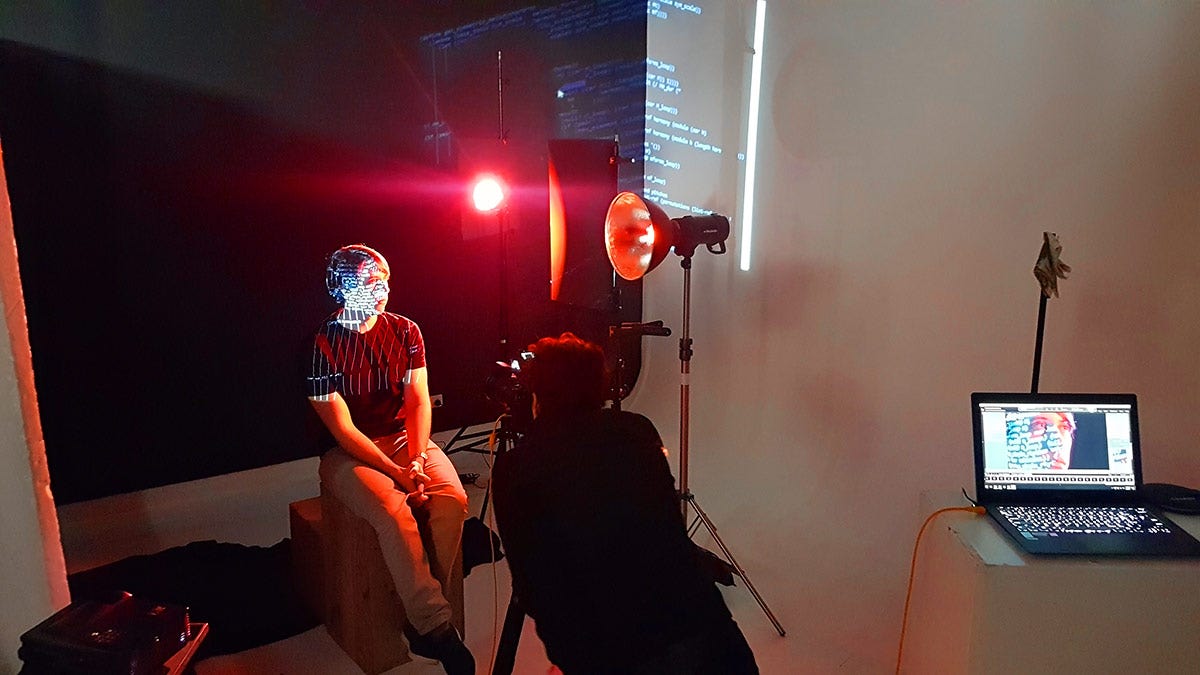
2 gelled lights, 1 old projector and a 'rag-on-a-lightstand' look-spot. Simple yet effective!
One issue with the plan to flip Vanessa's portrait in post to mirror Matt's is that the 'flip' would also reverse the words projected on her face. Luckily the digital projector had a 'rear screen' function so we used that to project the computer code on Vanessa as a mirror image, so that when her face was reversed in post the text would read correctly and not be mirrored. (Are you still with me? Does your brain hurt yet? Did I mention I kind of LOVE working out tricky photography puzzles?)
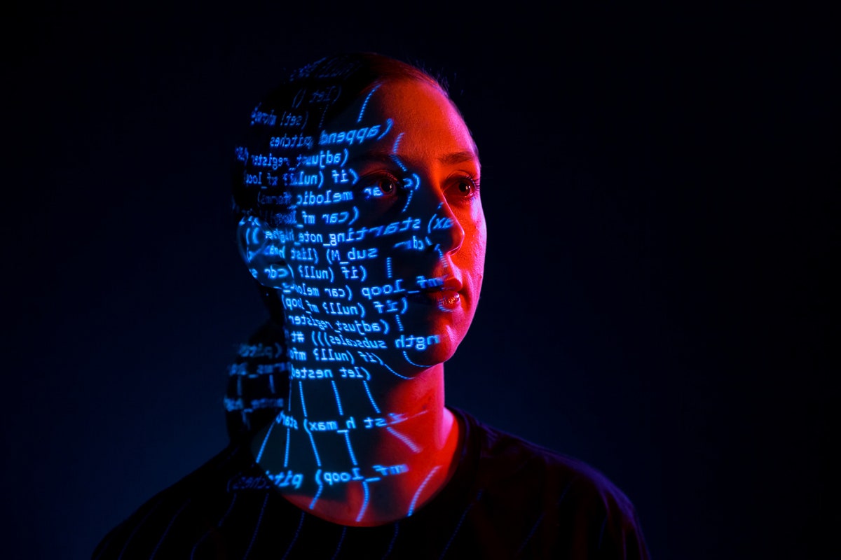
Out-of-camera RAW file of Vanessa before the 'flip', with reversed projector text, and showing all the colour & lighting effects captured in one shot in camera.
The images were 90% complete in-camera, with Photoshop used for minor facial retouching and to join both heads together into one unified image.
I had notions of messing around with their eyes to give a silvery or mirrored look to make them more androidy, but in the end I just removed the visible catchlights from eyes and realised this one tiny alternation gave a subtle-yet-creepy robot-like feel to the faces without needing any other Photoshoppery.
Our lighting setup included a gelled blue light in the background to create a blue glow emanating from behind & between the two heads, 'like the shining dawn of our new android future.'
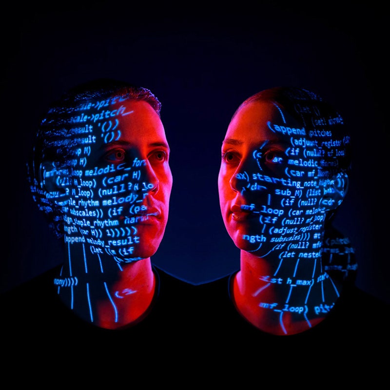
Final album cover image: Dark, creepy, retro and androidy. BOOM!
I love how the musical computer code worked in the final image - to me it looks like a 'window' into the inner machinations of Matt and Vanessa's android alter-ego minds. Is this what our future AI companions will think about when listening to the radio?
But wait there's more! The back cover
Physical record covers have backs, and we wanted a companion image for the back cover for the vinyl pressing. While the front cover has a 'future/digital' vibe, we wanted to complement it with a 'old school/analogue' feel on the back
We set up a still life image of Vanessa's gorgeous vintage manual typewriter whose clickity-clack key noises feature on their album soundscape.
To tie the front and back covers together visually and have them relate to each other, we used the same string of computer code that we projected onto Matt & Vanessa's face in the hero shot - this time hand-typed onto paper in the typewriter.
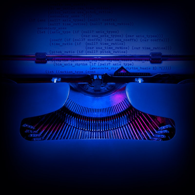
This Version Is No Longer Supported: Vinyl edition back cover image
I love the weird mash-up of seeing digital computer code typed out on a pre-digital typewriter - it's 'so right yet so wrong'. It's a great companion shot to the cover shot, and I love that it references the analog-tech-noises-composed-with-digital-processing soundscape that awaits on the album.
To make a great shoot come together on a tight budget, have the courage to just 'begin' before you have everything figured out - you'll be surprised with what you come up with along the way and how things will fall into place as you go. Award-worthy images are driven by good ideas, and ideas will bloom when you give them time to grow.
And don't forget that a simple idea executed well wins over a complex idea executed poorly. Detail nerds, unite!
Interested in contributing to the digiLife blog? Email community@digidirect.com.au with the subject line "digiLife Contributor", and include links to your photography portfolio and a writing sample.















Comments
No Comments yet. Be the first to comment.