We use cookies to make your experience better. To comply with the new e-Privacy directive, we need to ask for your consent to set the cookies. Learn more.
Photolab
0
My Cart


This is Part 2 of our 10 Lightroom Tips article, where we'll cover tips # 5 - 10. Read Part 1 here.
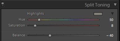
To add a subtle feeling of warmth you can bump up the White Balance to a higher Kelvin value, but sometimes I find that globally adjusting white balance feels like 'too much'. One way of adding a more subtle kick of warmth is with the Split Toning tab to add a touch of warmth just to the highlights. I generally use a value of 50 for Hue, and a Saturation value between 5 and 10. Use the Balance slider to find the overall strength you like.
Tip: you could save three versions as presets for 'Weak', 'Medium' and 'Strong' so you can apply them in future with a single click.
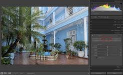
I don't typically do big heavy-handed adjustments in Lightroom, but sometimes a lot of minor tweaks can still add up to a big cumulative effect on the image. I always do a quick Before / After comparison after I'm done tweaking in RAW to sanity-check whether I've inadvertently pushed things 'too far' from the vibe of the original image.
After you've made your adjustments in Develop mode just hit the Backslash key to toggle between your adjusted image and the original un-adjusted shot to compare.
Editing a whole load of photos down to the best few shots can be time consuming ' anything that makes the process faster and easier is a top tip in my book. A great way to compare images for eeny-meenying is the 'N' key. Select the images you want to compare (as many as you want) then hit 'N' on the keyboard for an instant heads-up display of your selection.
Technically this is called 'Survey mode', but I just call it 'N mode' :)
It's especially useful for comparing non-consecutive images that aren't side-by-side in the grid.
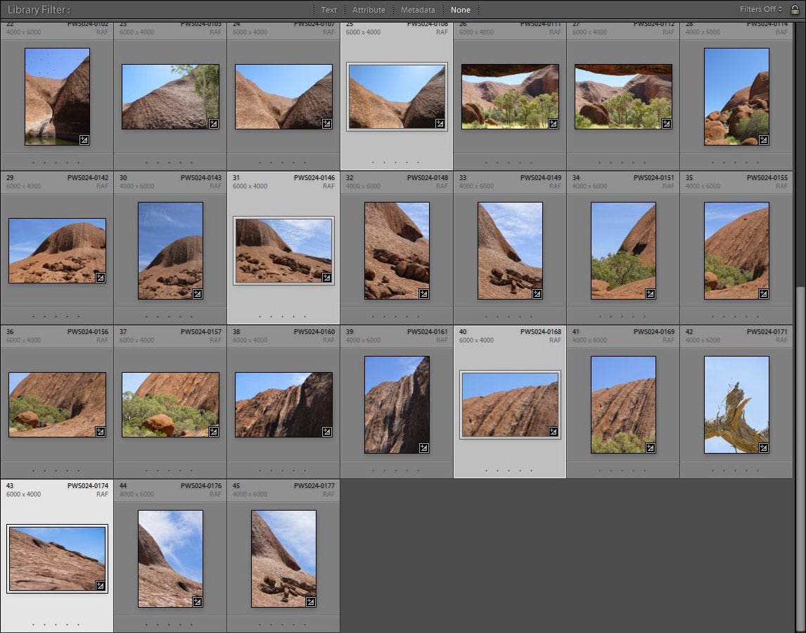
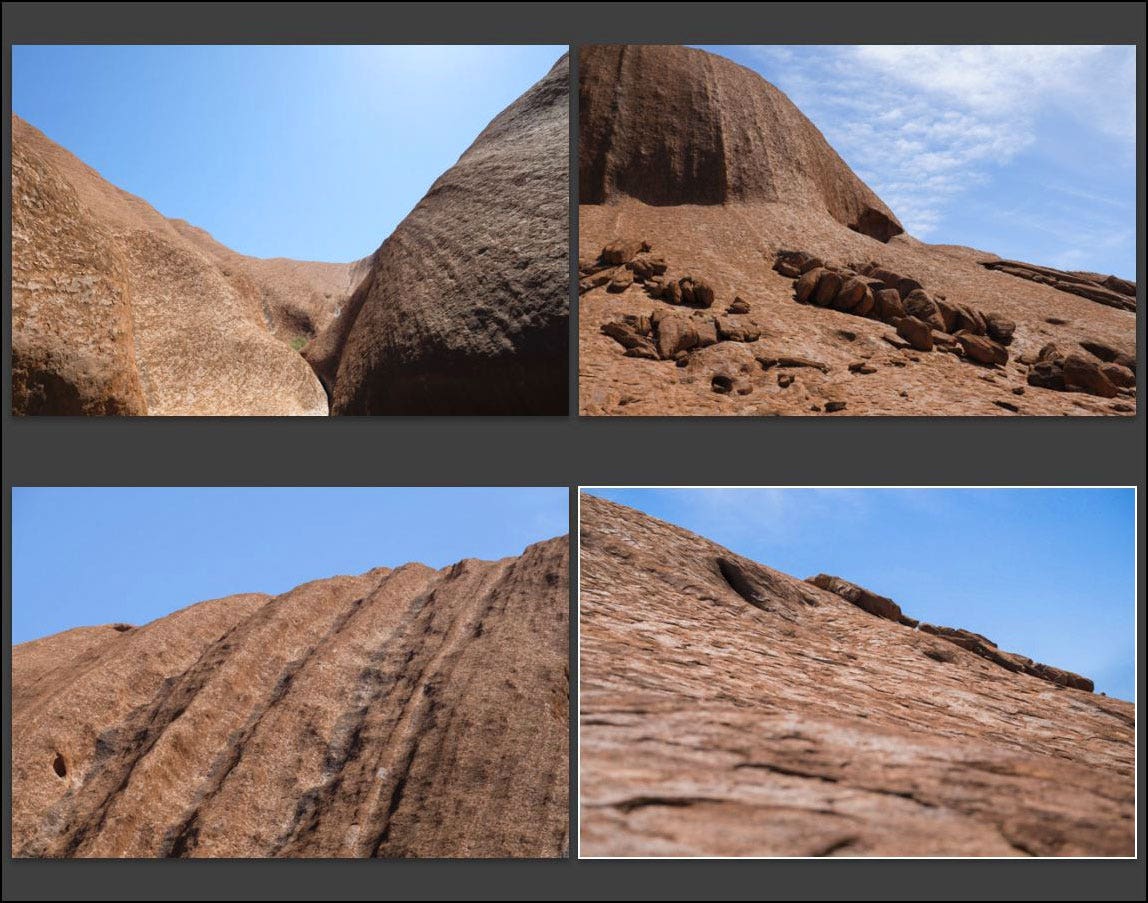
When viewing images in 'N' mode you can Ctrl-click / Option-click on an image (or click the little X in the corner) to 'knock out' your least faves to whittle down the selection until you're left with the best ones. You can add stars or colour labels, or drag-and-rearrange the image order in N mode view if you like. When you're done, just hit the 'G' key to go back to the image grid.
Tip: In 'N' mode hit the Tab key for more screen real estate by temporarily hiding the side panels.
Sorting through hundreds (or thousands!) of RAW images from a client shoot or a holiday requires a good method for sifting out and finding the best shots. Some people use star ratings to rank images, but I prefer using colour labels ' I'm a visual person (aren't all photographers by nature?) and to me the different colours are more quickly identifiable when I'm scrolling through the catalogue.


Here's my usual process:
Red = Longlist
Yellow = Shortlist
Green = Final selects
Reds:
Flick through all the images fairly quickly. Anything that's reasonably nice gets labelled Red (just hit the '6' key on your keyboard to make the selected image red. Hitting 6 again will remove the red).
I'm not being massively selective at this point, and not worrying about how many images I make red or if I'm choosing too many similar shots ' this is just about quickly identifying 'viable' images. Shots that are reasonably nice, in focus, not a test shot or a misfire, etc. It's a fast way of weeding out usable images from junk shots in one pass. Red means 'anything from this pile is worth considering'.
Yellows:
Set Lightroom to filter on Red and Yellows. We've only got Reds right now so your Grid view should be full of red longlisted images.
Now we're going to promote the best Reds to be Yellows. Go through the Reds and be more selective. Which are the better shots? Make them yellow by hitting 7 on your keyboard. Perhaps there are 3-4 shots of the same thing ' now's the time to eeny-meeny to choose the best one and make it yellow.
Be more ruthless and look for the better composition, expressions, critical focus, etc. Maybe I've got 20 shots of the Eiffel Tower and I want to end up with the 4-5 best shots from each angle. If I'm editing a client shoot, the Yellows are what get proofed out to the client for them to make their final selections.
Greens:
For a client shoot they choose the final images they want and I make those Green (use the 8 key on the keyboard). If it's a personal shoot I make the final selections for what gets made Green ' perhaps I'm working on a specific image series and I know I want 10 final shots.
Green labelled RAW images get exported for final retouching and grading. My rule of thumb is: 'Green = has been finished off in Photoshop'. That means when I'm trawling back through the Lightroom catalogue if I see a green labelled shot I know there's an accompanying finalised .psd version of it to refer to.
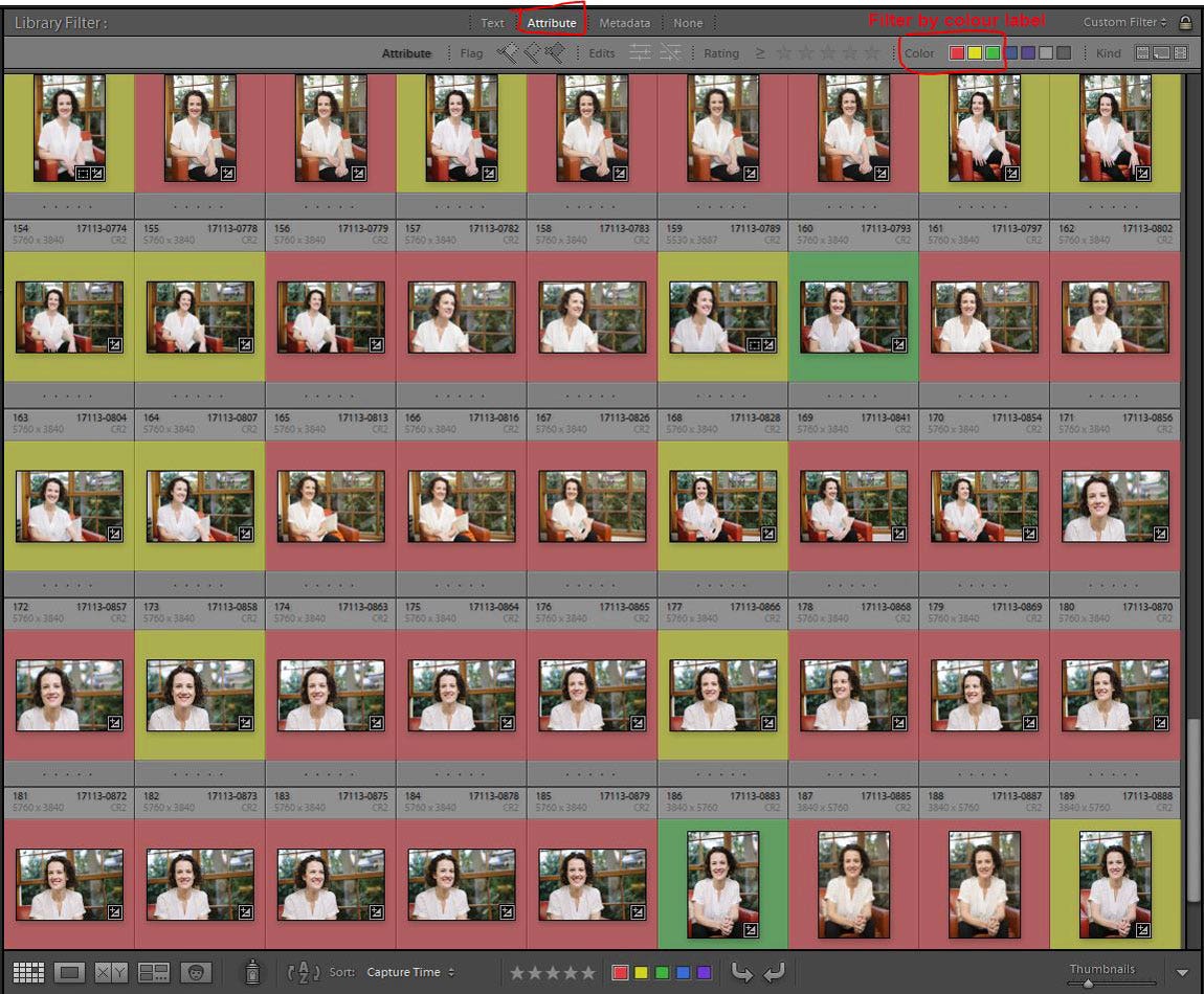
Colour labels let me see at a glance which images are usable (red), the better shots (yellow), and the final selections (green) that have had full retouching.
Tip: There's two additional colours of blue (9 key) and purple (no default shortcut key) if you want to use more colours
Lightroom lets you make a 'Virtual Copy' of a RAW image. The actual file on the hard drive isn't copied ' it's just a 'simulated' copy that exists only within the Lightroom interface.
Let's say you've spent ages tweaking RAW settings on a colour picture to get it to look how you want. But now you wonder if it mayyybe it would look better in high-contrast, grainy black & white. Instead of re-jigging all the RAW settings and losing the colour version you've painstakingly dialled in, you can make a new set of adjustments on a Virtual Copy. Right-click the image thumbnail and select 'Create Virtual Copy' to create a duplicate image - you can tell it's a Virtual Copy by the little 'fold' in the corner of the thumbnail.
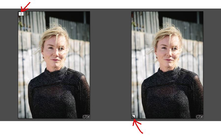
A Virtual Copy thumbnail has a small 'fold' in the corner, and will automatically be 'stacked' with the original
Now you can play around with settings on the copy to your heart's content without messing up your original. To delete a virtual copy just right-click and select 'Remove photo'. If you decide you like the copy better than the original, just synchronise the settings from the copy back onto the original, then delete the copy.
I also use virtual copies for single-frame bracketing. Dial in base settings on the original, then make one or two virtual copies with alternate settings intended for layering later in Photoshop. For example, the copy might be given different exposure settings to enhance a window area.
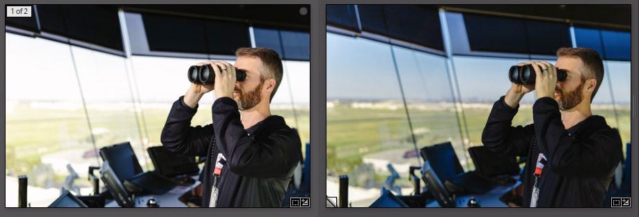
Using a Virtual Copy for single-frame bracketing to pull in window detail
In the example Air Traffic Controller image above, I dialled in settings on the original image that suited the person, then made a virtual copy and pulled down the overall exposure and increased saturation to reveal the colour in and detail in the window.
Select both thumbnails, right-click and choose 'Edit In / Open as layers in Photoshop' and then mask the layers together using Photoshop's better/smarter/faster masking tools,
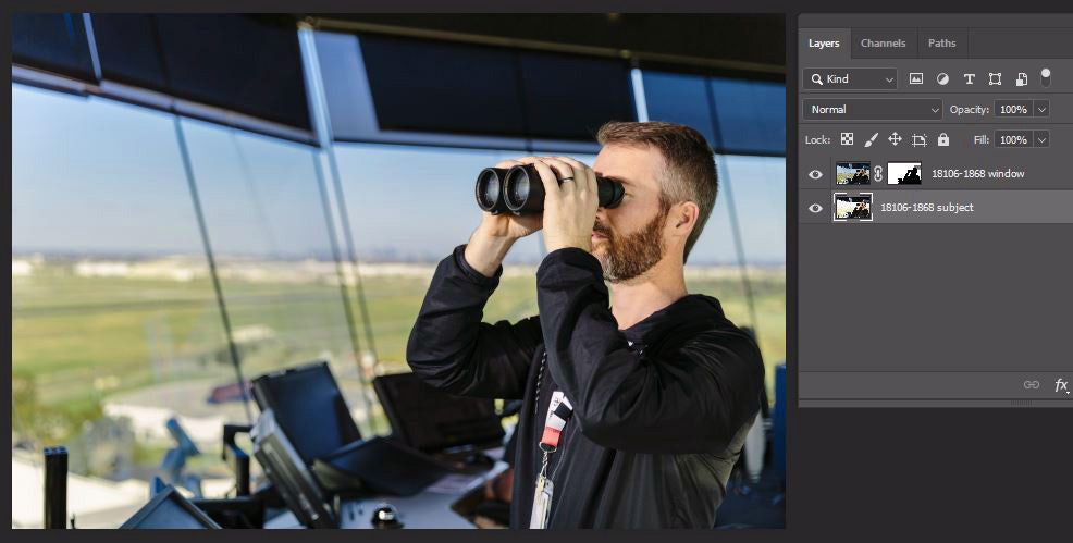
The two versions combined in Photoshop
You can use the same idea to blend copies with different White Balance, Contrast, Sharpening, etc. And because you're bracketing off a single RAW frame the layers will be 100% pixel-perfect aligned in Photoshop (not always the case when layering from different in-camera frames).
If you're shooting a series of frames that 'go together' ' e.g. a series of bracketed exposures, or multiple frames to stitch for a panorama ' shoot quick a photo of your hand before and afterwards.
Prior to using this method, I'd go out and shoot a bunch of bracketed series and then in Lightroom I'd struggle to find where each 'set' of images started and finished. 'Hmm. is that the start of the series or are those the test shots before I shot the 'real' series.' Bleah!
Shoot your hand before and after a series and voila ' you've now got visual 'bumpers' in your image editor to quickly identify key image groups. I use a 'trigger finger' for 'series starts here' and a flat palm for 'end of series'.
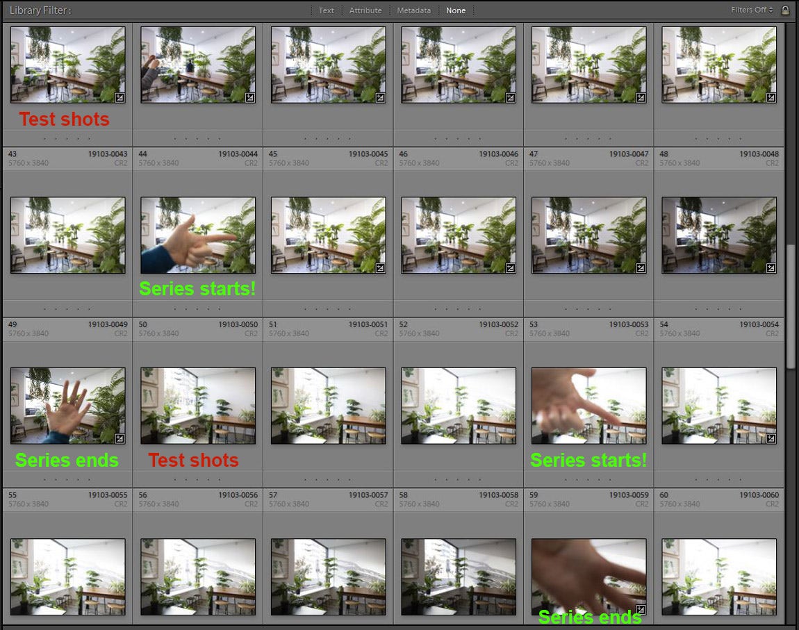
Hand 'bumpers' divide the setup/test shots from the 'proper' images in a bracketed series. I instantly know where the proper series are and can ignore the rest of the test shots.
It works great on shoots when there's a load of test shots at the beginning while we're getting a scene set up. We might shoot a bunch of frames while tweaking the lights, adjusting furniture etc. before the 'real' photos officially start. Shooting your hand to indicate 'Proper images are here!' means no time wasted wading through frames later trying to figure out what's what.
Hopefully you've found some helpful tips here! Some of them might seem minor, but they all lead towards a faster, more efficient workflow. If you incorporate 10 things that each save you a few seconds here and there, that can easily add up to making your editing session a few minutes shorter. And if you're a regular shooter, saving 5 - 10 minutes on each editing session quickly adds up to hours of time saved. Good luck!
Interested in contributing to the digiLife blog? Email community@digidirect.com.au with the subject line "digiLife Contributor", and include links to your photography portfolio and a writing sample.


Comments
No Comments yet. Be the first to comment.