We use cookies to make your experience better. To comply with the new e-Privacy directive, we need to ask for your consent to set the cookies. Learn more.
Photolab
0
My Cart


Editor's note: This is the first article in a series that will touch on the properties of light and how you can utilise them to improve your photography. Stay tuned for future entries in the series.
Want to take better photos? Learn about how light behaves. It's the single most important area to understand.
When you get started in photography you obsess about the camera. What shutter speed should I use? What the hell is aperture-priority mode? What does ISO stand for? That kind of stuff.
But a key thing to remember is that ultimately, even with all its settings and buttons and modes, your camera is still basically just a light-proof box. (Fun fact: the world "camera" literally means "dark chamber").
Even the most fancy-pants camera is, at its heart, just a dumb recording device, peering out at the world and noting down what it sees.
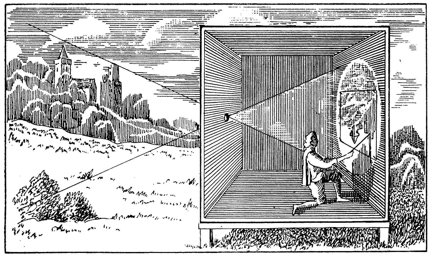
Your camera is basically just a light-proof box, recording what it sees "out there"
"We do not see objects; we see light. Because most objects produce no light, their visibility depends entirely on light reflected from them." Light, Science & Magic by Hunger, Biver & Fuqua
Here's a simplified explanation:
Light is made of zillions of photons. Photons are tiny particles of light. (According to quantum theory light is actually both a particle and a wave, but let's not go there. This is a simplified analogy after all).
I like to think of photons as miniature ping-pong balls. They are emitted from a light source (e.g. from the sun or a lamp) and bounce around and rebound off objects and things out there in the world. Kaboing. They bounce off stuff and fly into our eyeballs and we see things.
Some photons bounce off whatever it is your camera is pointed at and fly into the camera lens. The camera records data about the photons that come through the lens and hit the sensor (or film, or whatever alt-process media you may be using). Voilá - that recorded data becomes a photograph!
The photograph is the recorded result of how and where the photons have hit the subject (highlights) or not hit the subject (shadows). Your camera isn't "creating" the picture - it's just recording the picture as it's happening out there in the world.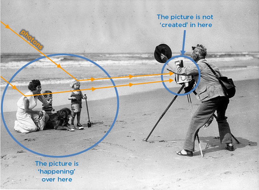
It's a slightly different way of thinking, but a powerful one. And it will make you a better photographer.
"Lighting is the language of photography. Pattern of light convey information just as surely as spoken words." - Light, Science & Magic by Hunger, Biver & Fuqua
We live in a 3D world (I really want to sing that to the tune of "Barbie Girl"). Objects have roundness, volume and shape. We can wrap our hands around things, move objects around in space and feel their heft.
But a photographic image has only 2 dimensions. It's flat as, mate.
Your camera peers out at our 3-dimensional world and makes a 2-dimensional representation of what it sees. So, the camera is not just a recording device - it's also a translation device.
So why and how do we see the 3D-ness of things in a flat 2D image?
What if I gave you a pencil and paper and asked you to draw a ball for me? You might start like this: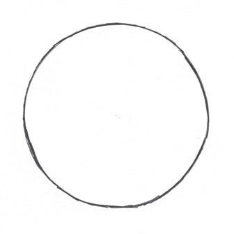
It's a good start - but it doesn't really look like a ball, does it? It looks like an empty, flat circle. It ain't got no heft.
But what if you added shading, like this:
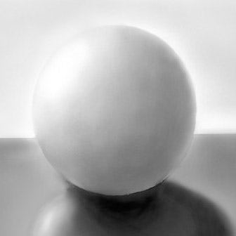
Now it looks like a round voluminous ball, sitting on a flat surface in 3D space.
The drawing is a 2D representation, but our brains perceive it as 3D because of - dum dum dahhhhhh - lighting cues! The brighter highlight side + darker shadow side of the circle makes our brain "see" roundness. (Lighting cues are also telling us the surface it's sitting on is shiny).
Lighter tones and darker tones mapped out in 2D space are basically a SPECIAL VISUAL CODE that makes our brains see a 3D realm that isn't actually there. Pretty cool when you think about it: I smudge some graphite on paper in certain patterns, and you "see" a ball. Or a box. Or a horse. MAGIC!
Drawing, painting and photography all share the same visual language. Highlights and shadows, perspective, composition of elements, etc.
The draw-a-ball exercise gets you thinking about how areas of light + dark makes things look "shapey" to our brains.
For photographers it means that if you change where the highlights and shadows are, you can drastically change the way a photo looks.
Here's an example using a ceramic vase I bought in Italy. It's got a nice simple conical shape.
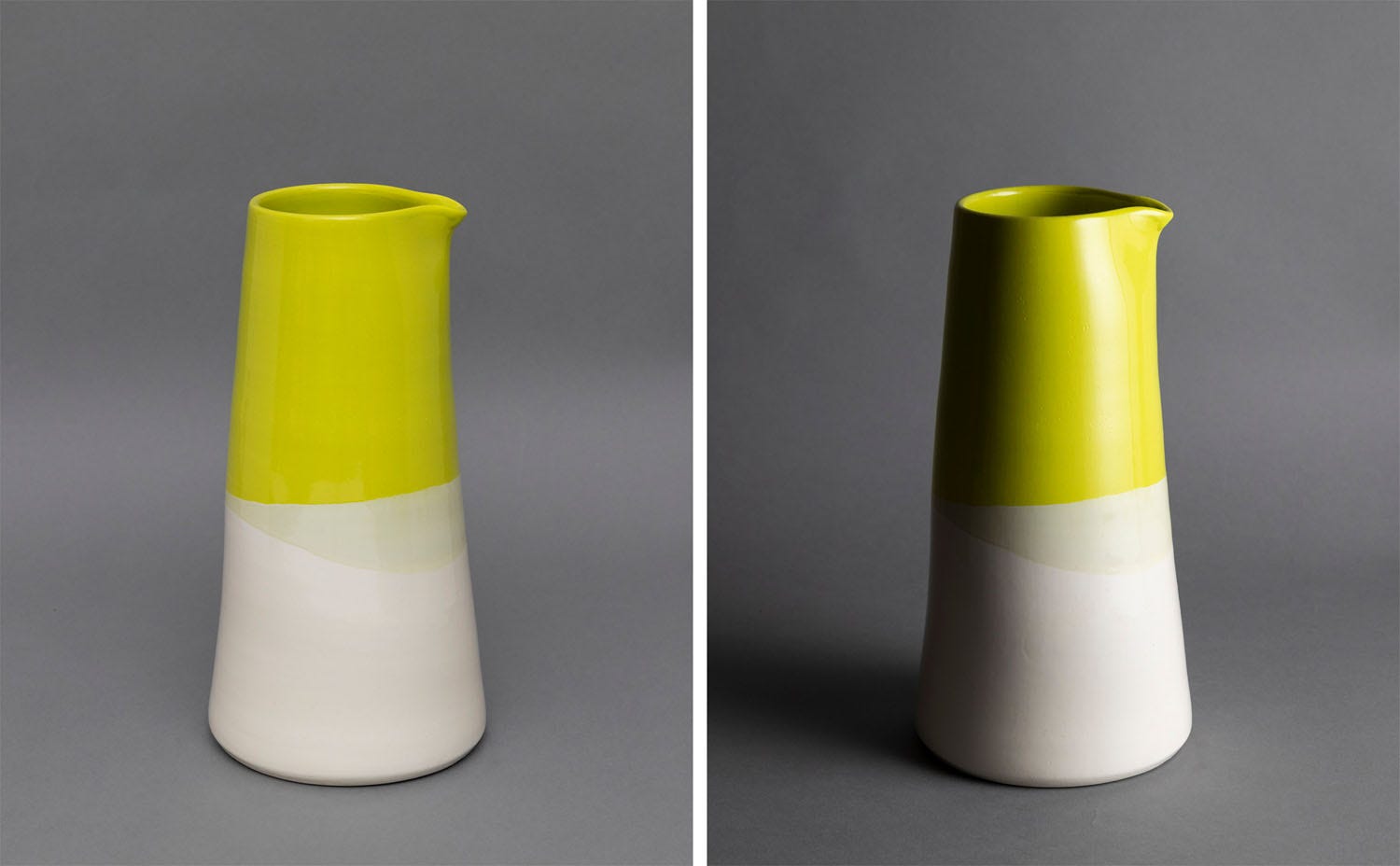
All-over lighting vs. directional lighting -
a strong highlight side + shadow side implies dimension and shape
The left photo was shot in even, all-over lighting conditions. The photons are ping-ponging off all parts of the vase from all angles, so the whole vase looks more or less the same brightness.
In the photo on the right I switched up the lighting to come at the vase from one side instead of from all over.
Now the light is flinging photons at the vase only from the right-hand side - this gives a distinctive highlight side + shadow side to the vase. The highlight + shadow cues makes the vase appear more 3D and shape-y in the photo. Note also how the shadow cast from the vase onto the grey paper anchors it and gives the image more of a sense of gravity and grounded-ness.
Being aware of what highlights and shadows are doing is also relevant in portrait photography, which is why the standard portrait setups (Butterfly, Loop, Rembrandt, etc.) are named after their different highlight + shadow patterns.
BTW the point is not that one lighting effect is "better" than another - just that different lighting has different effects on an image. It's up to you to choose the approach you think is most suitable.
The way light interacts with the thing you're photographing also affects the "mood" or subjective feeling of a photograph. Light can make a photo feel quiet and subdued, or vibrant and energetic.
Here's two trees-y shots - check out how the different light makes them feel different:
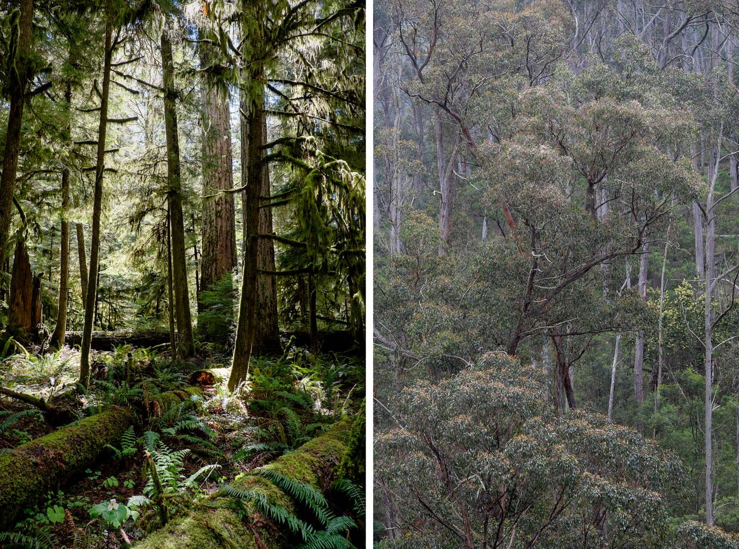
Which one feels more spacious?
Which one feels more energetic? Which one more quiet?
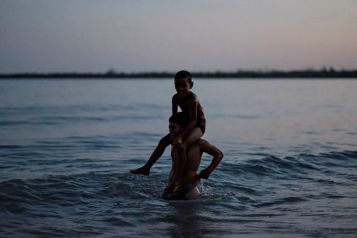
Here's another example pair of photos:

It doesn't matter if you're making use of natural daylight or battery-powered studio lights. Light is light is light. When you understand how light behaves (physics) and the ways it affects how your brain reads a photo (visual language) - now you're cooking with gas!
It means you can move your lightstand in an intelligent way to generate the look you want. It means if you're looking at a landscape you want to photograph, you'll know whether to shoot it now or come back at a different time of day.
Different lighting choices for different portraits.
If you're working as a photographer, it's your job to understand and be in control of lighting (whether it's coming from a window or a flash - or both).
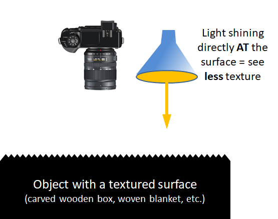
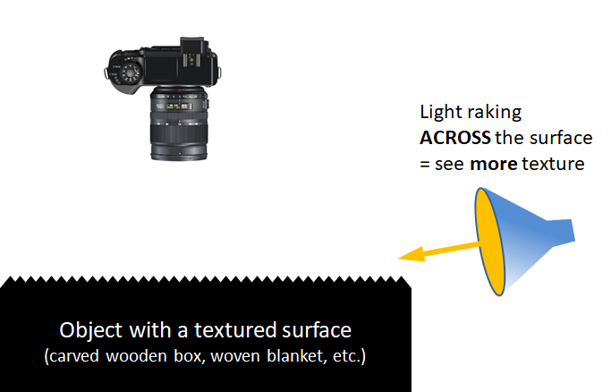
Let's say you're photographing something with a textured surface, and you want the texture to stand out and look really. texture-y.
Think back to our drawing of the ball - we made it look tactile and 3D by giving it a brighter highlight side and a darker shadow side. Our brain sees "highlight + shadow" and perceives the object as 3D.
Revealing surface texture follows the same principle.
Imagine you are a mighty eagle in flight looking down at a mountain range. If the sun is directly overhead then both sides of the mountain range will be evenly lit as you gaze down upon it:
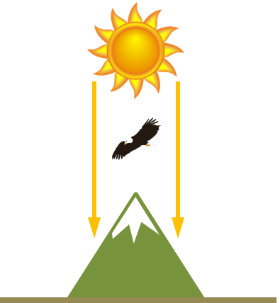
Both sides of the mountain range are evenly lit from birds eye view
But if the sun is off to one side, the light will hit one side of the mountain range only - the other side will be in shadow:
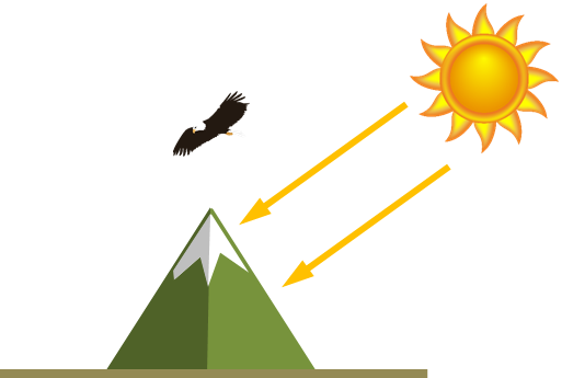
One side of the mountain is in shadow
Think of surface texture on objects like it's a miniature mountain range, and your camera is the mighty eagle.
To bring out texture, you can rake light across the surface, rather than aiming light directly at the surface. Raking light across gives the uneven surface undulations a highlight side + shadow side, which our brain reads in the photograph as 3D texture.
 |
 |
Here's a simple photographic example using crumpled paper:
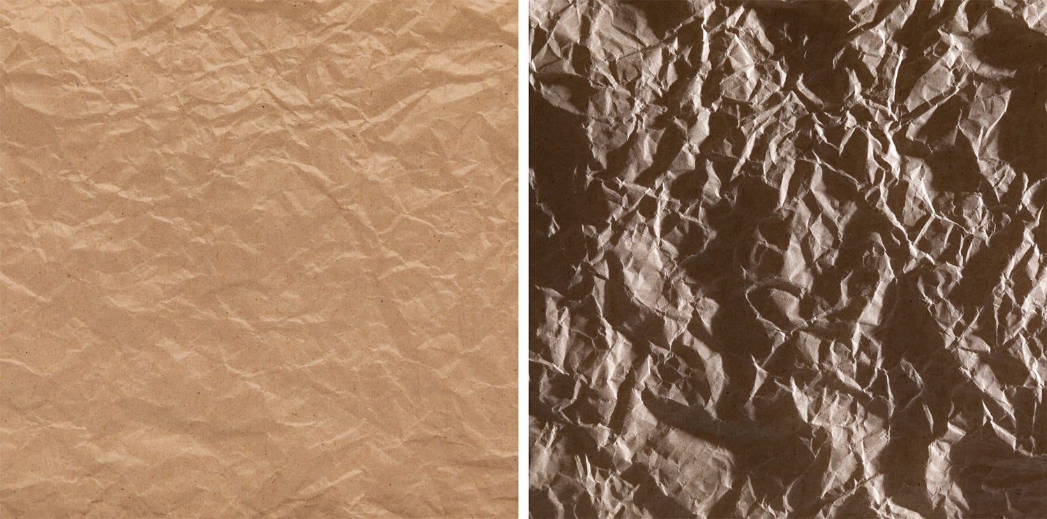
With light shining directly at the paper surface, the texture appears more subdued. The "mountains" look flatter.
But with light coming across the surface of the paper from one side, each crumple gets a highlight side and a shadow side - the texture looks bigger and more dramatic.
In practice you might use one approach or the other to enhance or subdue texture in a portrait background. Or to bring out the weave of textured clothing. Or to emphasise a detailed carving in a wooden surface. Or to smooth out unwanted texture in skin.
Remember also that if you're in a situation where you can't move the light source (e.g. if it's a window or the sun), that you can often move your orientation in relation to it.
Here's another texture example - an oil painting detail:
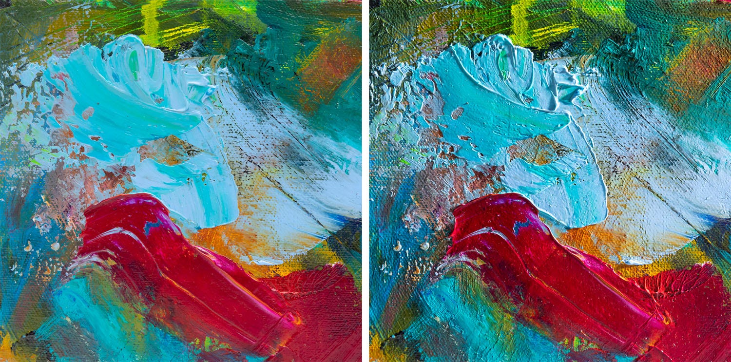 The left-hand shot de-emphasizes surface texture. The paint colours are more even.
The right-hand shot uses side lighting to bring out the surface texture - we perceive the gooey thickness of the paint. Even the weave of the canvas stands out!
Here's a final example I shot on my kitchen table this weekend for y'all using spices from my pantry (important note - I am not a food stylist! Took me 10 min just to get the cinnamon to sit nicely)
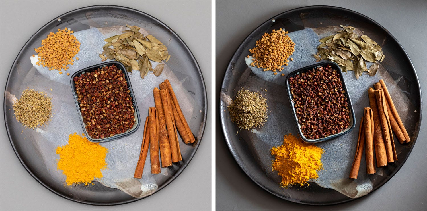
The left-hand photo was shot using all-over lighting. I made the light as even as I could. Ping-pong photons bouncing around evvvvvv-erywhere!
On the right is the same shot but now I'm raking light across the plate. It looks so different! Let's analyse why!

Detail of spices - and how changing the light makes a world of difference
Next up we'll take a look at sources of light. We'll check out the pros and cons of using Natural Light (e.g. the Sun) vs. Introduced Light (e.g. a Flash) - the qualities of each, and why you'd choose one over the other. Stay tuned!
Interested in contributing to the digiLife blog? Email community@digidirect.com.au with the subject line "digiLife Contributor", and include links to your photography portfolio and a writing sample.


Comments
No Comments yet. Be the first to comment.